
Interfaces Engineered for Cognitive Ease & Conversions.
A screen that looks pretty but confuses users burns ad spend and kills retention. We synthesize qualitative behavioral research, atomic Figma design systems, wireframe architecture, and clickable micro-interactions into frictionless digital experiences that turn casual visitors into loyal power users.
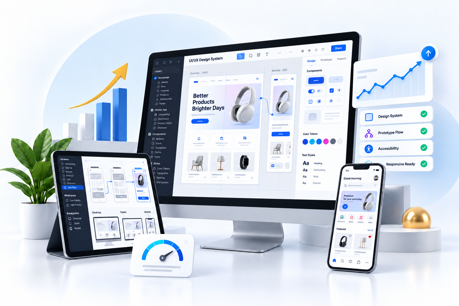
Atomic Library
140+ Figma Tokens
Conversion Lift
+68% Task Velocity
+68%
Task Completion Velocity
3.4x
Average Conversion Lift
100%
WCAG 2.1 AA/AAA
14 Days
Figma Prototype Sprint
Engineered for Clarity, Scalability, and User Delight
Great design is neither accidental nor purely aesthetic. Every screen, button placement, and micro-interaction is grounded in behavioral psychology and conversion economics.
User Research & Journey Mapping
Uncovering hidden user frustrations through stakeholder interviews, competitor benchmarking, session heatmaps, and qualitative persona modeling.
- Empathy maps & user personas
- Drop-off & friction point audits
- End-to-end customer journey maps
Information Architecture & Wireframes
Structuring content hierarchy, logical navigation trees, and low-fidelity schematic layouts before locking down colors and typography.
- Low-fidelity layout schematics
- Navigation taxonomies & sitemaps
- Mental model validation
Figma Design Systems & UI Tokens
Atomic design systems with global color palettes, typography scales, auto-layout components, and variants that ensure multi-brand consistency.
- Atomic component libraries
- Figma token variables (Color/Spacing)
- Dark / Light mode states
SaaS Dashboard & Enterprise Web UX
High-density information dashboards, analytics drill-down charts, role-based workflows, and complex administrative control panels made intuitive.
- Multi-tenant dashboard UX
- Complex data table filters & export
- Role-based permission interfaces
iOS & Android Native Mobile App UX
Adhering to Apple Human Interface Guidelines and Google Material Design 3 with thumb-zone ergonomics, fluid swipes, and haptic feedback.
- Thumb-friendly touch targets (48px+)
- Gesture transitions & sheets
- Offline state & skeleton loaders
Conversion Rate Optimization (CRO) UX
Redesigning checkouts, lead forms, and onboarding flows with psychological cues, microcopy refinement, and A/B testable variations.
- Frictionless 1-page checkout flows
- Microcopy & value messaging
- A/B split-ready UI variants
The 5-Stage Human-Centered Design Blueprint
How we take your digital product from messy user hypotheses to polished, developer-ready Figma architectures.
Friction Audit & Empathy
Analyzing analytics funnels, user session recordings, and customer pain points to identify core drop-off bottlenecks.
Wireframe Skeletons
Mapping screen hierarchies, user decision branches, and responsive layout foundations before visual design.
Design System & UI
Building atomic Figma component libraries with tokenized typography, elevation shadows, and color styles.
Interactive Prototype
Clickable, animated prototypes tested with real users to validate task ease and eliminate friction.
Developer Handoff
Exporting Tailwind/CSS tokens, SVG asset catalogs, auto-layout documentation, and conducting design QA.
Traditional Surface Decorators vs. Code of Dolphins UX
Understand why engineering-minded UX design saves months of costly software rebuilds and generates higher lifetime value.
- Subjective Aesthetics: Designs based on personal designer taste rather than user behavioral data.
- Messy Figma Files: Ungrouped layers, no auto-layout, and hardcoded hex colors that developers hate.
- Zero Accessibility Check: Low contrast text and unreachable tap zones that violate accessibility standards.
- Static Dribbble Polish: Looks stunning in a static screenshot, but falls apart when real dynamic data is loaded.
- Broken Handoff: Designers disappear after exporting PNGs, leaving developers to guess responsive states.
- Behavioral Psychology: Information architecture designed to reduce cognitive load and accelerate task completion.
- Production Design Systems: Tokenized color palettes, typography scales, and responsive auto-layout components.
- WCAG 2.1 AA/AAA Compliant: Built from day one with accessible color contrast and screen reader accessibility.
- Dynamic Edge Cases: Designed for empty states, loading skeletons, error validations, and overflow edge cases.
- Developer Pairing & Design QA: We provide CSS/Tailwind specs and inspect staging builds to ensure pixel fidelity.
Modern UI/UX Toolchain
We utilize the world's most advanced design, prototyping, and usability testing platforms to deliver frictionless experiences.
Figma & FigJam
Design Systems & Flows
ProtoPie / Principle
Advanced Micro-Interactions
Maze & Hotjar
Usability & Heatmaps
Stark Accessibility
WCAG Contrast Audits
Tailwind & CSS Tokens
Direct Developer Bridge
Adobe Creative Suite
Vector Icons & 3D Assets
Domain-Specific Interface Expertise
Each industry has unique cognitive workflows and conversion drivers. We tailor the user experience to your sector's expectations.
SaaS & Cloud Apps
Onboarding walkthroughs, self-serve subscription plans, and high-density analytics tables that maximize customer retention.
eCommerce & D2C
Frictionless product filtering, sticky Add-to-Cart buttons, express 1-click checkout, and post-purchase tracking portals.
FinTech & Banking
High-trust data security indicators, step-by-step KYC flows, instant transaction receipts, and clean financial reports.
Mobile Super Apps
On-demand delivery tracking, geolocation maps, fluid bottom-sheets, and offline-resilient mobile UI states.
UI/UX Design Inquiries Answered
Everything you need to know about our research methodology, Figma deliverables, and developer collaboration.
Explore Complementary Digital Capabilities
Bring your verified UI/UX designs to life with our full-stack engineering team.
Ready to Transform Your Interface into an Effortless Revenue Engine?
Schedule a 30-minute discovery consultation with our principal UI/UX designers. We'll audit your current product flows or wireframes and outline actionable steps to lift usability and conversions.